Wednesday, August 3, 2016

Interior Landscape Murals Painted for a Kid Friendly Space

Interior Landscape Murals for a Kid Friendly Environment

I spent a summer painting murals for a private school as well as a drop-in center for kids in Durham, NC, and I wanted share my progress for those of you who are looking for mural inspiration. This blog post focuses on the drop-in center called Sleeping Grass, located in Durham, NC.


Landscape Mural in Progress for Drop-In Center

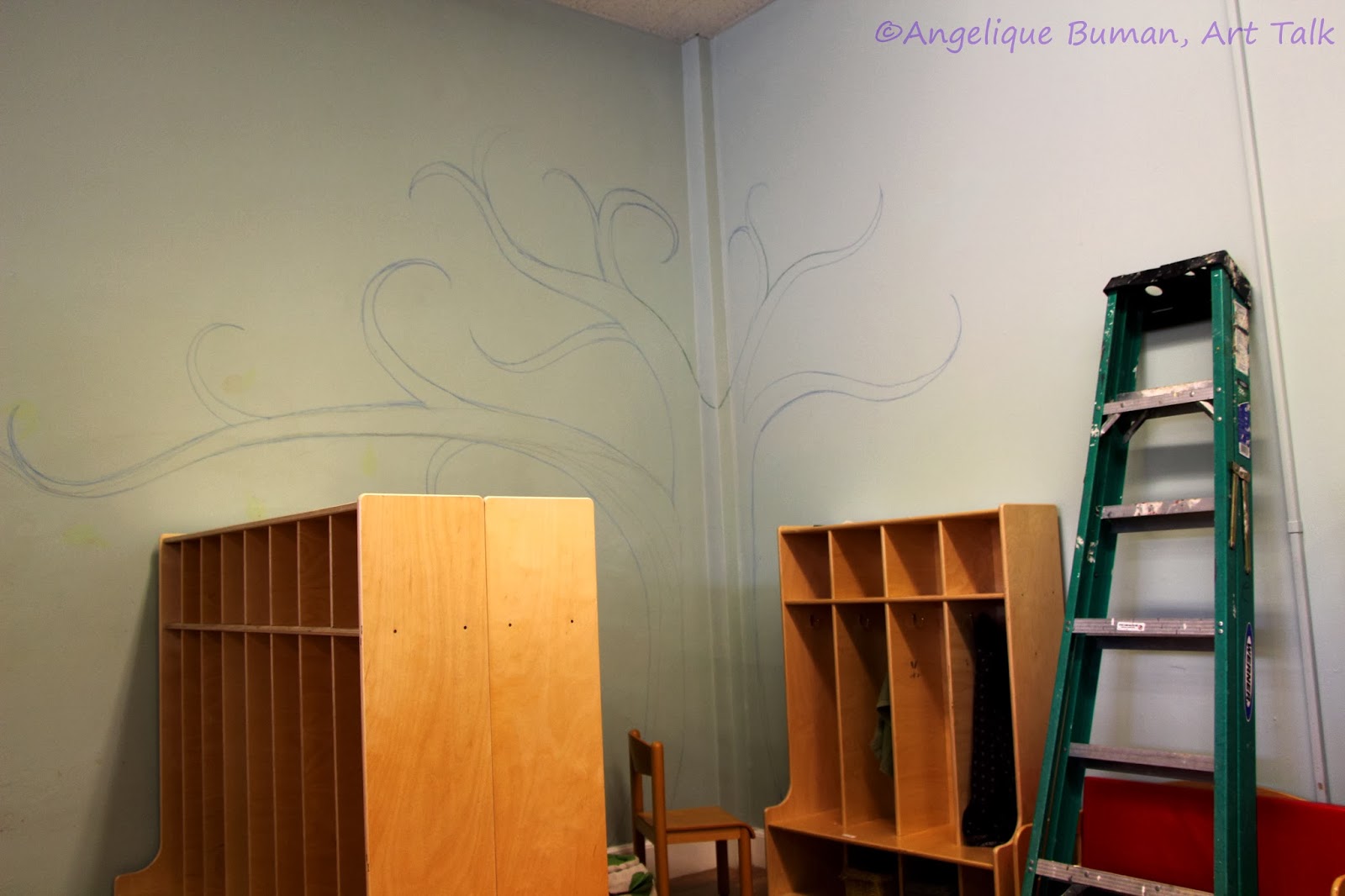
The owner of a local drop-in center called Sleeping Grass has requested a field of green grass on the walls to capture the essence of the business' title. The location is an adorable 2 story home built in 1935. I primed the walls of the living room with interior wall paint and filled in big areas with a variety of shades of greens and blues, along with some hints of orange to create depth.


Abstract Waterfall Mural on a Fireplace Mantel Built in 1935

In the same house, my field (above) carries over to a fireplace where I was able to get creative with a variety of silvery and shiny colors on multiple bricks to capture colors from a waterfall. In contrast, every other brick was painted in muted grays and greens to create an abstract rock wall. This is a nonworking fireplace and the owner envisioned this area to be a "cozy corner" for children to have a place to snuggle up with some pillows and read a book.


Sand Dunes Mural 

On the opposite wall, the fields blend into large sand dunes. I focused on the hill and bumps as if I was working with a large pile of blankets. In the back of my head, I couldn't stop thinking about Dali's famous melting clocks in an empty desert. Eventually, I added a sunset to warm the environment up, but I'm glad to have captured this image in its early "dark & uncanny" stages. I somehow managed to overlook this wall when I took photos, so I do not have the finished product posted just yet. I hope to return to the drop-in center in the near future to capture the finished look.


How the Murals Function in a Kid Friendly Space

The murals all came together with the designer touch of furniture and decor. This drop off center is called Sleeping Grass, based off of the grass that "falls asleep" when it is touched, by folding its leaves inward and hanging low. Some people find it intriguing and whimsical, the way this grass protects itself by reacting in such a way.


To Learn more about this creative and loving environment, visit sleepinggrass.org

Thanks for Visiting!

Mural Credit: Angelique Bowman
Designer's Touch: Mastaneh Christofferson

We also have a facebook fan page you may visit:

Sunday, January 19, 2014

Tutorial on How to Paint a Tree Mural to Create a Cozy Corner

 My Tutorial on How to Paint a Simple Tree Mural for Cozy Corners

Great for Classrooms, Bedrooms, Hallways, Bathrooms, Yoga Space- Any Empty Area that Needs New Life!

Today's blog is an extension to my blog tips on painting murals, which offers general tips that you may also find helpful.   This post is meant to focus on a very simple wall painting which is one of my favorite go-to murals when I don't have much time.  You can pull this off even if you aren't much of a painter.  Tree paintings are timeless, so you can't go wrong.  Especially, if you're working with a simple, iconic or decorative version of a tree.  No need to get detailed here.  I try to keep things loose, free flowing, and decorative.  That said, if and when mistakes are made, this is a very forgiving project that allows for flexibility.

Supplies for Painting a Tree Mural to Create a Cozy Corner:

  • Angle interior brushes in various sizes
  • Value Pack Artist Brushes for small detail areas such as the tips of the branches
  • Interior Paint- Go to your local hardware store and choose a paint color for the trunk of your tree and a color for the leaves.  If you are going as large as I did, a pint of each color should be plenty.  You will probably have left over paint that might come in handy for touch ups, but if you are on a budget you could get a sample size for the leaf area.  I suggest semigloss paints, since they are less likely to chip than a glossy paint.  I chose a warm green semigloss paint called lime green and a deep warm brown like this here, dark brown.  You may want to consider getting a premium paint with primer in it if you are concerned that the paint won't take well to your walls. 
  • Two containers of water
  • Several rags 
  • Gloves for protection
  • Plastic sheets, bags or old sheets to protect floor and furniture surfaces surrounding your designated area
  • Optional: Interior Primer Paint, if your interior walls are in serious need of primer

Tutorial on How to Paint a Simple Tree Mural for a Cozy Corner:

1.  Find an Empty Wall that Needs Life.  So you've chosen a room.  Take a moment and step out of the room, then walk back in and take a quick glance around.  Is there a corner that feels cold or boring?  That could be the perfect corner that is beckoning for some life! Protect the floor and furniture around you with plastic, an old sheet, or whatever you have to work with.  Make sure your wall surface is smooth, clean, and ready for paint to be applied.  If you are concerned that you need a primer, don't bother with that step just yet until you've started drawing.

2. Start Drawing! 

Sketch out some ideas on paper first, but don't spend all day.  If you want to mimic my style, keep your trees free flowing with loose strokes, curvy branches, and swirly twigs.  I basically draw my trees with long, narrow, and wavy triangles.  If you feel that you are no good at drawing, either ask for some help from a friend, or keep this pointer in mind:  The base of the tree is going to be thicker than any part of your tree. When you start drawing, picture an isosceles triangle, with the narrow side at the base of the trunk (where your wall meets the floor/floorboard) and the long sides of the triangle standing tall, reaching to a point where branches will sprout from.  Begin branching out by drawing smaller isosceles triangles, with the short side of your triangles starting from the top sides of the trunk.  Allow these triangle to be loose and curvy by allowing the ends of the branches to curl up, much like the shape of a simple Santa hat drawing.  Don't get too caught up in this sketch if you are pinched for time.  I didn't even bother with a sketch and dove right in.  I make mistakes all of the time, but like I said, this project is very forgiving.

Loosely begin to draw your rough image on the wall that you intend to paint your mural.    Keep it loose and don't be afraid of the mistakes, because sometimes you can "branch off" from your mistakes.  And if you are beginning to panic because you did something that doesn't look right, just hang in there, because once we get into the painting part, you will find that you can can easily cover up your flaws. If you are drawing a tree in a corner of a room, just fold your tree drawing in half to represent two walls.  I enjoy using colored pencils to draw, but you could use markers or sharpies, if you prefer.  I would suggest using colors in blue and green on the branches and brown on the trunk (which I'll explain why later).  The drawing is not permanent, so please don't get caught up in perfectionism.  Try not to erase or wash away when you think you messed up and just keep adding to the branch where you think one needs to be added.  Colored pencils can easily be blended into your paints, and mistakes can often end up adding an artistic touch.  Don't be afraid to press hard and make some definition with your pencil.  This will be very helpful when conquering the steps to come.

4. Determine If Your Tree Needs Primed.  You don't want your mural peeling off later on down the road, because you painted the mural on a high gloss surface.  I tend to change things around quite frequently, so I don't bother with these types of things as perhaps one should.  I went ahead and painted my tree on a semi-mat surface with regular semi-gloss paint and it still stands tall.  If your tree is something you want to keep long term, consider if priming would help.  What you will need to do is fill in your tree with a solid layer of primer, and then literally pretend like you are adding big clouds to the branches (which will represent the leave area).  Some of the branches will get lost in the primer, but you can redefine them with pencils after the primer dries.

Concerned about the condition of your surface and not quite sure how to prep it?  Check out these fabulous 13 Painting tips from Popular Mechanics.

3. Prepare Your Smokey Leaves
I begin with the leaves first, to create a translucent wash over the sketched out branches. I prefer the smokey look, so I don't worry about painting individual leaves.  The technique I am about to explain is much like the faux cloud technique that many painters use to create depth and texture on walls.  However, I keep it real simple by skipping the sponging step.  I just dive in with an old wet rag.  Wear some gloves if you are trying to stay clean and then dip a rag into a container of water, ring it out, and put it aside.


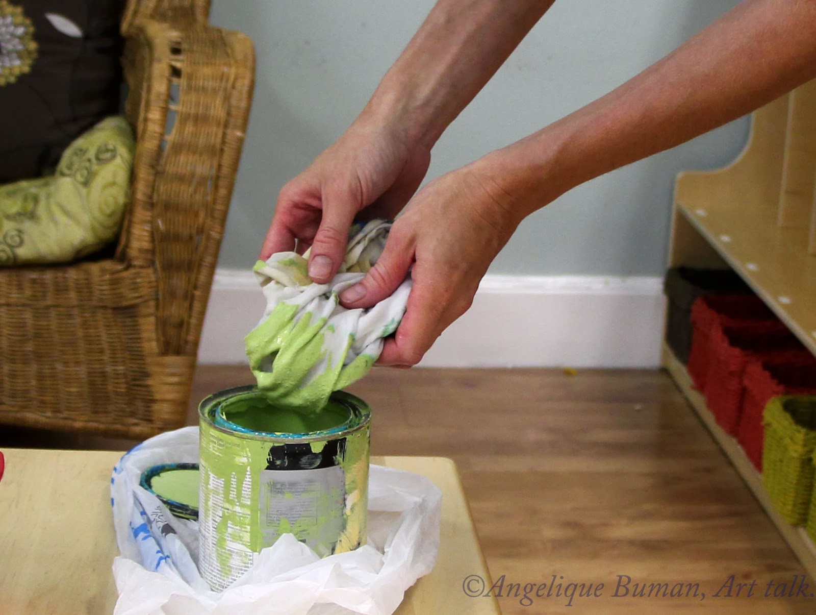
Now, dip another rag into the water, ring it out thoroughly, and dunk it into your thoroughly mixed paint of choice for the leaves.  Mash it around in your hands to saturate the color consistently throughout your rag and ring it out enough so that the paint isn't dripping from the rag.


Bunch up the paint-covered rag and head over to the wall to start swirling around and over the ends of your branches.  Have the clean damp rag handy for wiping away mistakes.  Now press the paint-covered rag to the wall and begin making circular motions as if you are cleaning a window.  Circle further out past the branches to create a fuller look.  Do your best to be quick by continually moving along to different areas, considering the paint may dry quickly when being applied so thin.  If you spend too much time in one area, you will find that the paint begins to get spotty or rub away, causing muddiness.  Don't worry about the areas looking even and move on.  The painting will all come together much better when you step back.  Periodically as you run low on paint, dip it back in the water and apply new paint as before.


 Have an extra rag handy if you want to start clean.  Imagine that you are creating a big fluffy cloud hovering the tree and do not be afraid to paint over the branches.  


You might notice that your drawing of the tree is beginning to get smeared, but it shouldn't matter if you drew with colors that compliment the paint color.  This is where mistakes can be forgiving as these smudges can add subtle softness and texture.  Don't worry too much about rough edges and periodically stand back far away from the painting to view the image as a whole so that you better see where you may be lacking some cloudy swirls.  You can use the clean wet rag to smooth out any rough edges, and don't forget to rinse it in the clean water once in a while.  This process is not meant to be symmetrical, but random and free flowing.  If there are areas that you've toyed too much in, leave them alone and allow those areas to dry completely before trying to fix them up by adding more paint.


4. Start Filling in the Tree with an Angle Brush
Once you've given the cloudy leaf area a chance to dry, before diving in to the next step, don't forget to touch up any branches with a colored pencil, if needed.  Prepare your paint for the bark, grab your angle brush and begin at the base.  Fill in the trunk area and begin to move up through the branches.  The angle brush should come in handy since you can paint strokes in various sizes.  Press into the wall with your paint dipped brush and drag it along the wall to get thick strokes.  As you branch off into thinner areas, let off a little on the pressure and tilt your brush at your desired angle in order to narrow the stroke.  Have your artist brushes handy and choose smaller brushes to fill in the tips of the branches.


Almost done!  You may need to add another coat to the body of your tree after it dries, that is, if it looks spotty after it dries.  I did my best to put the paint on thick the first time, and just had a few spots to touch up when I came back to it the next day.


And there you have it.  A cozy tree mural.  As for the birds and owl, these were extra images that I added later to go along with our school themes.  I hand painted them with acrylic paint.  If you want to add some birds or additional art, google up some decorative bird images to work from.  If you don't consider yourself much of an artist, check out your local craft store and see what kind of stencils are available.  The animals aren't really necessary to create a peaceful setting, and adding too much may even become a little busy for your liking, so don't get too caught up in the idea and appreciate what a simple tree painting has to offer.

If you have any additional questions or comments, please reach out and I'll do my best to give you any advice or input you are looking for.  Thanks for reading along!

Monday, January 6, 2014

Discount Code to Purchase my Paintings until February 2014 Only!

Hi Y'all,

For the new year, I thought it would be a good start to offer my paintings for 90% of my profit price.  That does not include shipping and material since the printing company still needs to pay for that.  But check my paintings out if you get a chance!

The code is: JAKMFL

 Below is my most recent upload.  If you just want a plain old print or a gift card, this is also an option.  I like to buy the gift cards and then frame them in a 4in by 6in frame, or a 5in by 7in frame with 4in by 6in matting.  It's a really cheap way to buy prints!  I have a link attached to the painting, and as you see I have a watermark on it, but it will not be visible once purchased.

 Angelique Buman Art
Enjoy and I appreciate the support!
~Angelique

Friday, November 29, 2013

Using Both Oils & Acrylics on Canvas

My Approach to Using Both Oils & Acrylics on Canvas

Decisions, Decisions... Oil or Acrylic?  I say both!
I have always had a strong love for using oil paints, but I admit, it takes patience before putting in another painting session while waiting for a coat to dry.  Oils can also get expensive and I spend more money on paints when painting strictly in oils.  It's usually worth it, but I have found an interest in mixed media over the years, particularly with oils and acrylics.  The cost ends up being a little less (though not much) and the paintings are just as valuable to me.

Do Your research Before Using Both Oils & Acrylics
Let me get one thing straight:  I don't physically mix the two paints together while wet.  I start with a base of dry acrylic on canvas and go from there with my oils.  Keep in mind that the longevity of mixing oils and acrylic has been in debate for many years, so I suggest that you do some research if you are concerned.  I've been using this technique for almost a decade and the quality of my paintings still appear in mint condition.  Personally, I am not concerned if a painting is going to outlive me or generations to come, as long as it got some enjoyment from my viewers and customers.  Needless to say, I'm sure my paintings will still be around, passed down to family and friends.

Using Both Oils & Acrylics in a Nutshell:  Acrylics First, Oils Last.

I don't have to wait around for days for my acrylics to dry as I often do with oils, so it only makes sense for me to begin the base of my paintings with acrylics first.  I usually wait a few hours or less for my acrylics to dry, depending on how thick the paint is applied.  Sometimes, just to be sure, I might leave my painting alone for a day before adding oils to the painting.

In a nutshell, here's what I'm about to explain more thoroughly:  First off, having experience in painting with acrylics and oils separate from each other will make this process a lot easier.  Begin your painting with acrylic paint by applying acrylics just as you would any acrylic painting, using water and acrylic mediums whenever needed.  Allow your acrylic painting to completely dry.  Add oils to give accents, add imagery, or to build up the painting however you'd like.  You can treat the oils as you would with any oil painting, so feel free to use your favorite mediums, mineral spirits, and paint thinners.  Read on for a better explanation and specific tips on creating a painting consisting of both acrylics and oils, step by step.

Step 1: Acrylic Application

Map it Out & Begin Your Painting

Before you begin, you may need to map out the obvious: what you are going to paint, what is the first layer, and how do you want it to build up from there. Once my gessoed surface is prepared (and dried), I typically begin painting my entire canvas with acrylic.  I personally find that acrylic paint works great for backdrops, large surface areas of color, and for layering, while oils will later serve for refining details.  For example, if I want to paint a portrait of a person in front of a pale blue sky, I will  mix a pale blue hue with my acrylics and cover the entire canvas with a backdrop before ever considering adding the person.  You may paint multiple layers to build up your back drop and get as detailed as you wish, keeping in mind how much detail you want your final layers of oils to play a part of.  If this is your first time, I would suggest reading following advice before diving into the acrylics...

Layering & Sketching

Understanding How Oils will Appear on Top of Dry Acrylics

As you are painting with Acrylics, take note that any dark or bold acrylic colors may be seen as transparent through your oils.  Depending on the mood you are trying to create, this can be a great way to show the process by allowing your under-painting to peek through.  I like to add acrylic layers to start building up the subject I want to refine in oils.  One way to do this is to paint the highlights and shadows of your subject in acrylics or begin to block in large areas of solid colors found in your subject (with acrylics).  When it's time to add the oils, you will find that these acrylic under layers will add richness and color that compliment your oils.  If you don't want your acrylic backdrop to be seen through the oils, choose light acrylic colors that will be easy to paint over such as white paints.  Completely paint over the areas of your backdrop that you intend to build up with oils by painting your subject areas with the white paint, or mix up your own neutral acrylic.  If you are not bothered by the fact that your acrylic backdrop will play a roll in how the oils will appear, then just fill the entire canvas with acrylic colors of your choice.  If you just want to go head and paint an entire backdrop scene in acrylic, you can always sketch out additional images with your oils later.  I have included some of my favorite techniques below that I use to sketch on top of my dried acrylic backdrops.

Approaches to Sketching Out Your Image onto Your Finished Acrylic Backdrop:

  1. Sketch with Acrylic Paint:  If you want some of your under-painting to show through the process once the oils are added, you could plan ahead and sketch out your subject with some acrylic paint.  Choose a neutral color if you don't want the sketch to be too obvious, or use a bright and bold color if you really want it to stand out.  Don't forget to let the sketch dry completely before adding oils. The great thing about sketching with acrylic is that once it's time to paint with the oils, you can take a cloth to wipe your oils away if you make a mistake, and your acrylic sketch is still in place for you to give it another go.  Just be mindful that you may nob be able to wipe it completely clean of oils if you have a textured surface.
  2. Sketch with a Sharpie:  Use a neutral colored sharpie such as brown for less obvious marks or yellow if you don't want the marks to be seen at all under the oils.  Use dark, bright and bold sharpies to make a statement.  Go ahead and draw directly on your (dry) acrylic backdrop.  Sharpies usually dry within a few seconds, but you could wait 3 minutes if you want to be safe before diving into the oils. If you need to refine your sketch to sharpen your proportions, take another colored sharpie or bold acrylic paint color and draw over your first sketch to add colorful layers of the process.
  3. Sketch with Colored Pencils:  If you prefer that your sketch is painted over, lightly draw it out with colored pencils.  I would suggest sketching in colors similar to the oil paints that you will be using to paint over the sketch, in case of bleeding of the pencils.  This shouldn't be an issue if you use a good quality colored pencil such as Prisma, and make sure you are not using watercolor pencils. The colored pencils may not take very well to the acrylic if your surface is textured and bumpy.
  4. Sketch with a Lead Pencil:  I typically don't use lead pencils to sketch my image out on top of acrylics, because I don't like the effect it has on oils.  I would suggest testing it out before making the choice of using pencils.  Take into consideration that soft lead pencils could bleed when painted over, and hard ones might be too hard to cover over with oils.  The harder the pencil, the darker, so a medium lead pencil might be your best bet.  You be the judge.  Here is a scale of how pencils are graded when shopping for artist pencils. 

 Hardest  Pencils----------------->                Medium  Pencils----------------> Softest Pencils    
9H   8H   7H   6H   5H   4H   3H   2H   H   F   HB   B   2B   3B   4B   5B   6B   7B   8B   9B

Step 2: Oil Application

Now that you have a better understanding of how the acrylics will respond under oils, go head and start painting.  The best way to do this is to explore on your own.  If it's not turning out the way you want it or the way you saw it in your head, then take it in a different direction and make your painting abstract.  It takes some time to get used to this technique, so just have fun with it.  Below are some tips that you might find helpful.

How to Create Transparency of the Under Painting Using Oils:  If you want the process of your acrylics to shine through, there are some tricks to emphasize this technique.  First off, as I mentioned above, bold and dark acrylic colors will be much more likely to shine through your first layer of oils. Begin painting and filling in the desired areas with oils.  You will find that light oil colors such as yellows and oranges are more naturally translucent than purples and browns.  Create a thin wash with your oils by using a paint thinner or another oil medium if you want the surface to be especially transparent.  Don't be afraid to wipe away your oils and play around with different techniques if you are not satisfied.  Keep in mind that you may not be able to wipe it completely clean, depending on the texture of your acrylics.

How to Build An Opaque Surface of Oils:  First, be sure to read my section above, Understanding How Oils will Appear on Top of Dry Acrylics, as these steps will be helpful before applying your oils.  To cover up areas from your underpainting, you may need to paint the best you can over the areas with your oils, allow this first layer of oils to dry for a couple of days, and add another layer of oils on top of it.  You can also avoid thinning out your paints by avoiding paint thinners.  In addition, dark and rich pigments will be easiest when covering on top of your acrylic painting.


I hope this information helps someone!  Please let me know if you found this helpful as I love hearing from my viewers!

Photos coming soon.


Thursday, November 28, 2013

Happy Thanksgiving!

Thank you everyone for all of the comments and support on my artwork.  I am thankful for my readers & audience.  I wish you all a wonderful day.

Angelique

Saturday, January 5, 2013

Watercolor Paintings on Display to Dry

In my art studio loft for my students, I have the kids "loft dry" their watercolor paintings by hanging them on a wire with clothes pins.  In addition, we pin a ruler with clothes pins to the bottom backings of the paintings in order to keep the painting from curling.

  Not only do my students enjoy seeing their art on the walls, but it is a quick and easy way to rotate art as well. This has been especially helpful for small paintings of 8 by 10 or larger, but I imagine you could use a yard stick for even larger images.  Our favorite way to display the paintings while drying has been to hang them within a picture frame with no glass or backing.  To learn how to wire a frame like this, see a quick and simple tutorial with pictures that I have posted on my craft blog:


If you don't have rulers, you could also use thick cardboard strips or paint mixing sticks, too.  
I hope this helps! 

Sunday, December 16, 2012

My Studio Space Renovated For My Students

Over the summer, I made some room in my studio to make it kid friendly, so that I could teach fine art to them.  Recently, an additional room was added so that I have more personal space.  Below is one corner of the room for my students.  To see more images, go to the link below.  As soon as I get my space cleaned up, I'll post the area that I do my own work in.  This has been such a great addition for the kids to really embrace and appreciate the arts.


To see more photos of this new space, you can visit my blog specifically for my little fine art students:

Saturday, November 24, 2012

Photographs Digitally Altered


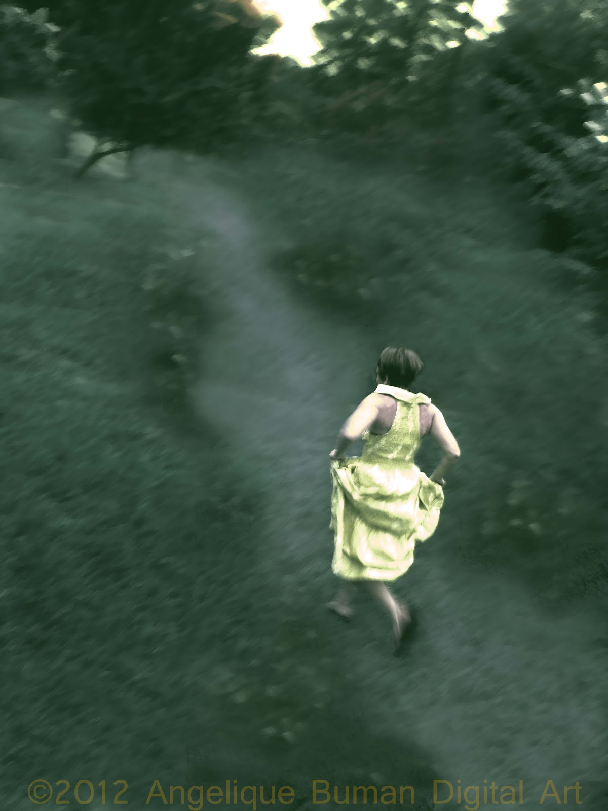
"Break Away"
This image is available to purchase in prints here:  My Artist Website

This image started as a photograph--a motion shot that I took of a neighbor running back to her house in a new dress that someone recently made for her.  I caught her in the moment and something about it reminded me of Cinderella or Alice in Wonderland, so I spent a few hours in photoshop and here’s what I came up with.  

Now to break it down step by step:

For those who are familiar with photoshop and are just curious about my approach, needless to say, it was very experimental.  I started off by making a quick selection of the girl running and then fine tuning it.  I inversed the image and then began working on covering the car and street with the clone tool.  I realize this is considered an old fashioned technique now, but I enjoy having some control over the placement of things as I copied and pasted parts of the grass and trees. I used the softest brush option with about 90 percent opacity/flow and made my placements with a path in mind.  Then I used the soft brush and a low opacity to paint a path (taking the color from a light area in the trees).  I used a textured brush and added some spots alongside the path to create flowers.  Finally, I added some lighting effects (go to Filter; Render; Lighting effects) and used a default spotlight, angling it on my path.  I added a lens flare (also found under Render) that started behind the trees, and voila.  Of course, I did lots of experiments before choosing the final route.  I played with the colors through different adjustment layers and I changed the textures of the girl’s surroundings with different filters.  I know this is all in a nutshell, so if you have any specific questions, please feel free to ask and I’ll do my best to answer.  

Here is the image before I made the path. 

I toyed around with colors before I decided on the final image.  I was debating on the path looking more like fog.  What do you think?

Sunday, August 26, 2012

Tips on Painting Interior Murals & Decorative Wall Art for Beginners


This year at the school where I teach, I was moved into a new classroom that has been neglected of interior decorating.  So before school started, I began working on small decorative murals to create a cozy and welcoming environment.  I did not want to make things too busy, so I chose to paint calm and peaceful imagery like trees, ponds and fish.  I will post the finish product as soon as I get the opportunity.  It was a really great experience and a nice change from the kind of work I do in the studio.  If you are interested in painting murals, but have never done it before, I have some tips for beginners after the following images.
Trees are great for beginners since there are so many styles that you can get away with, you can be inventive and you don't have to get terribly detailed to make a statement.  This wall is in the cleaning area of the studio.
I painted some very basic decorative art in the children's wash station.

If you are a painter but have never experienced painting murals and you are interested, just go for it!  You can always paint over something with some interior paint if you mess up, no biggy.  My tips are in no particular order and if you are lost on anything, please ask questions.

TIPS FOR STARTERS:
  • Collect interior wall paints that you have used in your own home as they work great as a base for any painting, especially to fill big spaces up like tree trunks, water and sky scenes.  
  • Buy small sample paints of fun colors you want to experiment wtih at your local home improvement retailer store.  These little samples go a long way.  For example, you can do washes to help the paint to cover large areas.  If you don't want to wait for an employee to mix the colors for you, some paint brands like Martha and Valspar sell cute little samples to experiment with.  Here is a link to show what you should look for.Paint Samples  
  • Save large brushes that you use for interior/exterior painting, even if they are beat up.  Old brushes can be good to create texture in bushes, flower patches in a distance, etc.
  • You may want to start small and simple in case you realize that it is more time consuming than you thought (which has happened to me too many times-- I never learn!)
  • Surf the web and google images of interior wall art, modern art, and decorative art ideas if you don't know where to begin.
  • Sketch designs on paper and/or start drawing directly on the wall with a light colored pencil.  If you mess up, don't worry about the pencil marks until later. I don't use led pencils for this part, because I have run into certain paints or washes that seem to have a harder time covering up pencil lines, but typically it's not a big deal if you are drawing lightly.
  • Have rags handy as it may be the best tool for blending paints.  Rags work good for washes and textures.  Old t-shirts, jeans, anything with texture (as long as it is not a material that contains too much fuzz or lint that could come off onto the wall while you are painting, and if you aren't sure test it out first).  You can dip a rag in water, ring it out and dip a little into the interior wall paint to create a nice base wash that could represent clouds, water, sky, or just to add some depth to a wall.  You might want to rub in random circular motions for clouds, bunch up and dab areas to create bushes or rocky textures, and wipe horizontally to create a soft sky.  Have a dry rag handy to wipe away any areas where the paint looks too thick. You may also want to use a sponge or a frayed paint brush to create different textures.  
  • Do not spend much time in any area when making washes and using interior/exterior paint as it will only start to get muddy.  Try to only spend a few seconds everywhere your brush/rag touches.  If you aren't terribly happy with how things are looking and it's not wiping away, WAIT for it to dry before tampering with it again.
  •  Once you have your base colors down, I find that smaller art brushes and acrylic paint works well for details on interior walls.  I usually do not use my oils since they take much longer to dry, and they may not work well on top of other paints or wall surfaces.
  • Fill the entire wall with the most basic shapes and colors before getting detailed.  In other words, keep things simple until the end, and if you feel that it needs more detail, go back.  Otherwise, if you get too detailed right off the bat, you might realize that you don't have the time or energy to get detailed in other areas.  A wall might  not look very big at first glance, but once you start working on it, you will realize that this could get very time consuming.  Unless you are going for a realistic look, a nice modern appeal is to keep things simple and painterly.

I hope this helps.  If you have more questions, just ask!


Everyone liked my classroom much that I was asked to paint a mural in another classroom.  I was happy to do so.

Wednesday, June 6, 2012

Later this Month, Classes Will Start in My New Studio!!

I'm so excited to have more space to offer in my art studio, as well as more storage.

This summer, I will be teaching ages 3-9 the fundamentals of painting and drawing by encouraging originality and creativity.  My students will get many opportunities to mimic famous artists as we study art history and explore famous art.  Many of them will also be learning how to sew with needle and thread as well as basic techniques on the sewing machine to create pouches, purses, pillows, or whatever inspires them.  My lesson plans also include many educational lessons that will help build fine motor skills to strengthen their writing abilities and coordination.

Last but not least, my students, the "Little Wonders of Wonderland," will be selling their art work on a new website I have recently launched.  http://little-wonders-of-wonderland.artistwebsites.com/

I will be posting updates and photos very soon so stay tuned!!!

Thursday, April 26, 2012

Studio Renovation

My art studio is expanding!  Literally, a wall is being removed to open into another room that will give me 3 times as much space than I already had!  Now that I am teaching small groups of children, I will definitely be able to allow more children to visit when the space is finished.

Pictures coming soon!

Wednesday, February 15, 2012

Thank You Friends, For Your Support!!!

Dear Friends who recently purchased art from my website,

I appreciate you so much as you have helped me get a little bit higher in search engines. It takes a lot of work for me to advertise and keep active in the art community on the internet and in my own area, and every little bit of support helps. You are ultimately the ones who help me to get noticed. I have been spending countless hours lately trying to work on my art and advertising, and I am just so thankful when it pays off.

Again, I wish I could thank you all personally, and if I see you I certainly will.

Hugs, love, success and happiness to my customers!

For those of you just dropping by, it's not too late to purchase my art with the discount I posted in my last blog. You can click on my website in the right hand column.

Sunday, January 29, 2012

My Current Studio Space: Now Kid Friendly!

Photobucket
I've been sharing a cozy loft space for a studio with fine artist Shabnam Nassir, here in Durham, NC for nearly a year now. It is unique, because it is located up a steep stairwell in the corner of a large school playroom for children ages 3-6. I have been teaching at this school for about two years and only recently did I get the idea of teaching small group fine art lessons up in my studio. I toyed with the idea for a while, since I was nervous about having the children around my paints and other dangerous material, but I did some reorganizing, brought some child-sized tables into the mix, and started making lesson plans for this age group. I figured, what better way to teach fine art than to do it in a real live art studio?

The children absolutely love this new addition to their program. They know that in order to be invited to my studio, they have to earn studio time by being on good behavior during regular school hours. I explain to them that I need to know that they can be trusted in my personal space. For ages 3-6, these children take this offer very seriously and show great respect while I am giving a lesson in my studio. I am having so much fun sharing my space with them, and I think it has opened their eyes to a whole different perspective on what art can offer.

Photobucket

That's all for now, but stay tuned as I am working on a website for my students to sell prints of their work in order to raise money for more art supplies for the children (All profits will absolutely go back into the program). Thanks for tuning in!


As a loyal Artist of the Fine Art America organization, I like to sponsor a page every so often.
Here are some links to check out artwork from some of the artists at Fine Art America (FAA) Enjoy! female prints photography digital art

Wednesday, January 18, 2012

My Studio Space Back in PA at 1505 Art Works, Downtown Erie

Photobucket
After sharing a space with my brother Eric (see previous post), I moved into a bigger space with fine artist, Kirsten Bole. Kirsten is an extremely active artist who likes to paint big and bold on large wooden canvases that she builds herself. Sharing space with Kirsten was motivating for me as she always had something new in her head that she needed to get out through paint. My time painting next to Kirsten was always an experience; Kirsten was loud and expressive, had full of energy, and loved to share random stories about her life. I miss her bad-ass attitude and great sense of humor! Below is an image of our shared space. The two really large canvases are Kirsten's.


This was a really unique and large space in an old building dedicated to Artists in Erie, PA. Here is another angle of the room. You can usually tell our art apart pretty easily. Hers are big and painterly while mine are portraits in smaller scale.

Photobucket

This was a few years back in Erie, PA.

Currently I share a studio space with Shabnam Nassir, a beautiful fine artist from Iran. I will post images of our studio in a blog very soon.

In the meantime, I'll give you a sneak peak of Shabnam's style. If you want to see more, just click on the image:
Art Prints

Needless to say, sharing studio space has always been well worth it for me. It's a constant reminder to keep making and creating, because with a studio mate, you have each other to share praise, ideas, input and constructive criticism.

Monday, January 16, 2012

My First Shared Studio Space

A personal story about sharing studio space with my brother.

For the past 4 years or so, I have shared a studio space with other artists. When creating art, I am the kind of person who gets into a zone to a point where one might honestly believe that I don't need anyone else but me and my creation. However, in all actuality, the presence of others means the world to me while I am creating. It keeps me motivated to be around those who are creating and being productive. And when I say that, I don't just mean being around a fine artist, but any type of person who is inspired to create, experiment, and learn. True, I will get into my own zone, but the comfort of knowing that others are around and working their brains keeps me focused.

My first studio space outside of my own home was shared with my brother Eric Buman and his good friend Mark Graziano, both musicians and recording artist in Erie, Pennsylvania. In one room, I was painting and in the other, Eric and Mark were recording new musicians. We seemed to feed off of each other as we spent hours on end just hanging out and being productive. I certainly have a new respect for recording, and vise versa. Every musician who stopped in to get a recording by Eric and Mark would drop in and see what I was creating, always intrigued and interested in the way that we shared the studio space. It certainly was unique, I must say. Sometimes, it felt like a party, and sometimes it was a party... in a productive sort of way. All in all, we stayed busy and inspired.

Although this time in my life was short lived, it truly was very special. It was the first time in my life that I had a window into my brother's world, and vise versa. Even though my brother Eric and I probably spent most of our time doing our own thing, there was a new understanding and connection between us that was never there before. It was a time for growing together as we began to understand and respect each other for what we loved. Needless to say, I never really got close to any of Eric's friends until I met Mark. Prior to our studio time together, I was an outsider to my brother's world and sometimes his friends appeared young and disrespectful. But here I could clearly see that Mark adored Eric, believed in him, and together they stayed productive. I loved that Mark loved my brother, and he helped me to see the strengths in Eric. I never felt as close to my brother Eric as I did while sharing studio space together. It was during this time that we built a new love and trust for each other.

It is hard for me to find the words to explain, but I believe there is something about making art in some form or another around others that can bring you to a different level of understanding others. It's been years since I had the opportunity to share a studio space with Eric, but a connection was built and I believe it will always be there.

I miss you, Eric. I love you so much and I'm so proud of all that you've done. I hope someday we get an opportunity to share productive time together again. Hugs and love.

Readers, I realize this post was more for my brother than anyone, but hopefully I have inspired someone to be productive around someone you love.

Below is a link to one of my favorite paintings I painted back when I was sharing a studio space with Eric:
Photography Prints

I love fashion illustration. To view more fashionable art, check out the artists here at Fine Art America:
fashion art

Sunday, January 1, 2012

2012 New Years Art Talk Resolutions

Happy New Years, Readers! May your new year be happy, healthy and productive!

Last year I accomplished a lot, but I also got behind on things like updating my blogs and websites. This year, I hope to stay in better touch and share fresh new stories, information and art.

So where have I been and what have I been up to all of this time? A lot of school and work. I decided to go back to school after all, long after I said I'd never go back when I finished up my Fine Arts degree back in 2005. I am almost done with my schooling as I study to get my Montessori degree for ages 3-6. I have been working in a Montessori school as an assistant and fell in love with the original and creative way of teaching that I had to go ahead and learn more. It's been a lot of work, and I hardly have time to do my own art, though I often think about ideas and creations I want to get into.

As I finish up my Montessori training in these next couple of months, I should start having more time to start creating again. It's something I need to do this year. I want to make more time to create. I also want to make more time for dance, as I love hoop dance and other styles that have branched off of that.

And I don't know for sure if it will happen, but I am definitely going to look into being a home owner very soon. That way I can get creative in my own home, not feel bad about it, and make additions to suit my needs. I think it would definitely allow me to get even more artistic.

So all that said, the above are some of my New Years Art Talk Resolutions. Please write about yours if you are willing to share! Let's make this new year colorful and special!

Sincerely,
Angeique

Wednesday, February 16, 2011

Why Make Prints of Your Paintings? Consider the Consequences.

First off, whether or not prints are more archival than your art, the option of selling your prints has its benefits. There is always a risk of the original painting getting damaged. You also need to consider that sometimes things can go wrong often by accident or by experiment during the actual process of painting. Also, whether you are selling the art as a print or not, taking a professional photo of it and saving a printable image could last forever (as long as we've got technology). And sometimes, the archival quality of the prints may actually be in better shape than the original to begin with...

Consider the damage. If something were to ever happen to a painting from water damage, poor storage, transferring, or even a fire, you might kick yourself for not capturing the image in a photo to begin with. It's not the end of the world, but it meant something to you and could have meant something more to someone else.

Consider the condition. During the process of painting, how are you preparing your art? Did you cover the entire canvas with Gesso before using oils? Did you wait in between sessions to allow enough drying for your paint? Did you do a water color painting on a random piece of drawing paper? If you painted on Watercolor paper, will the paper eventually yellow? Did you experiment with different glazes without doing the research of possibilities of cracking, discoloration, and fading that could happen later on down the road? I have always been experimental myself, learning many lessons along the way. Now that I consider these things after experiencing all of the above, I am more careful and considerate. But I can never be too sure.

Consider the presentation. How do you want others to view your work? Personally, I prefer people to enjoy the originals of my oils and acrylic paintings. However, I tend to like the look of my watercolors printed. As much as I love watercolors, I don't are for the end look on paper and I'd rather see it on something like canvas. If your work is printable, there are a variety of materials to print your work on.

So, in some cases, yes perhaps prints are more archival, but there is nothing like looking at an original painting. However, we can still be inspired by prints. Needless to say, it doesn't hurt to take a professional photo of your work. Save a high quality file of your image for keepsake, your portfolio and possibly selling prints. You just never know what could happen to the original.

If you're interested in selling prints, there are so many places now that will do the dirty work for you. That's right, all you have to do is upload your work. I upload high quality prints of my work at Fine Art America. Check it out if you haven't yet.

My Prints

Sunday, February 13, 2011

Please stay tuned for the Winners of my Valentine's Art Contest

The votes are in! The winners are:

3rd place: Dolly Mohr
2nd place: Harry Mason
1st place: Arvind T Akki

I will be posting their images as well as some information about the artists as soon as they reach me. So stay tuned!


Code Technorati:
5BBFAXPPXRPB

Painters, Try This for a Palette

For years I've used the most typical painter's palette board to mix my paints-- you know, the ones with the thumb hole so that you can hold your pallet as you work. Or maybe just a big piece of Masonite board (also known as "hardboard" sold at your local hardware store). But most recently I have found it more efficient to use stretched canvases to mix my paints on. Why? Read on.

If you buy store-bought canvases from your local art store, which I so often do when I am on a time limit to get a painting done, you may notice that if you hold the canvas up to the light that it is somewhat translucent. This isn't necessarily a good thing. The white gesso (primer) that has already been painted on for you is meant to be a strong base that is going to help add body and strength to the painting. It also gives you a stiffer and more durable surface when you are applying heavy elements. Some painters put 5 coats of gesso on before they start their painting. The store bought canvases typically apply the thinnest coats of gesso, probably to save on money. When you paint a picture on these canvases without considering the durability, it can be really tacky when someone holds your painting up and sees that light is getting through the canvas. I learned this the hard way when I entered a show where the paintings were on glass windows instead of walls. What I'm getting to is that it doesn't hurt to prepare your store bought canvas with another coat of gesso or paint before you begin a painting on it.

SO why not build up your canvas this way: Start mixing your color pallet on a store-bought stretched canvas or one that you have already stretched and gessoed yourself. Ultimately, you will be able to use this canvas again later on down the road. Use it as a pallet until you have covered all of the white gesso base. Hold it up to the light and see how translucent your base painting is now. This can add a lot of texture to your n=base as well as some great under-paint that can add a whole different feel and quality to your next painting. If there are just too many colors for you and it is feels too busy as a base, then just paint over it with one solid color. Now you've got a really strong base that is ready to be painted on. Or maybe, you enjoy all of the different colors on your pallet and your palette might just work as a decorative painting for your house. I've got one of mine hanging up in the bathroom.

Sometimes I use old paintings that I just don't care for as a palette board. I take a picture of the painting for keepsake and then I cover the ugly thing up with rich colors. Eventually, this too will be used as a base to a new painting. Also, if you're not one to paint on canvases and prefer wood or hardboard, it doesn't hurt to use it as a pallet first either.

Photobucket
Here I have my palette standing upright. This works sometimes, depending on the consistency of the paint. This palette is in the process of covering up an old painting I didn't care for.

Wednesday, February 9, 2011

Capturing Paintings in Progress

In the past two years I find myself more interested in documenting the progress of my paintings, because I have begun to appreciate the process as a journey that it worth reflecting back on. To me the underpainting, or the work in progress, can often stand alone just as strong as the finished painting. Most recently, I started taking professional photos of the work in progress to sell as prints. There is an entirely different feel to the work in the first sessions in my work, often appearing more sketchy and illustrative than the finished image. Some people might actually prefer this style over the finished look.

So, why bother finishing the painting if it seems to be at a finished state already? Sometimes it is fun to do quick paintings that have a loose feel to them, but often times I enjoy spending time with my oils and really getting detailed in my conceptual portrait paintings. Usually I have a vision of how I want the final product to look and the work in progress is usually a pleasant surprise that I run into along the way. I’ll be honest, sometimes I want to just be done, but once I have spent time mixing up a colorful pallet of oils, the show must go on. In other words, I have to continue the painting because I have a strong desire to paint the figure and capture all of the colors in someone’s face. To me, the skin tones can be the most challenging but also the most rewarding. I like to emphasize the subtle colors in one’s face that we don’t always notice. For example, your shirt may be lightly reflecting onto your jaw line, so I might enhance those colors to create more relationships between the colors throughout the painting. So all in all, following through with the original plans of a painting is often the route I like to choose and documenting the process can also tell a story about how I got there.

Here is one example of some sessions I did on a commissioned painting for a couple:
Photobucket

Photobucket

Photobucket

This is my most recent documented work that I am just finishing up on. First i sketched out the boy on an old painting of mine that I didn't care for.
Photobucket

Photobucket

Photobucket